Community Design for Civic Engagment
How It Began
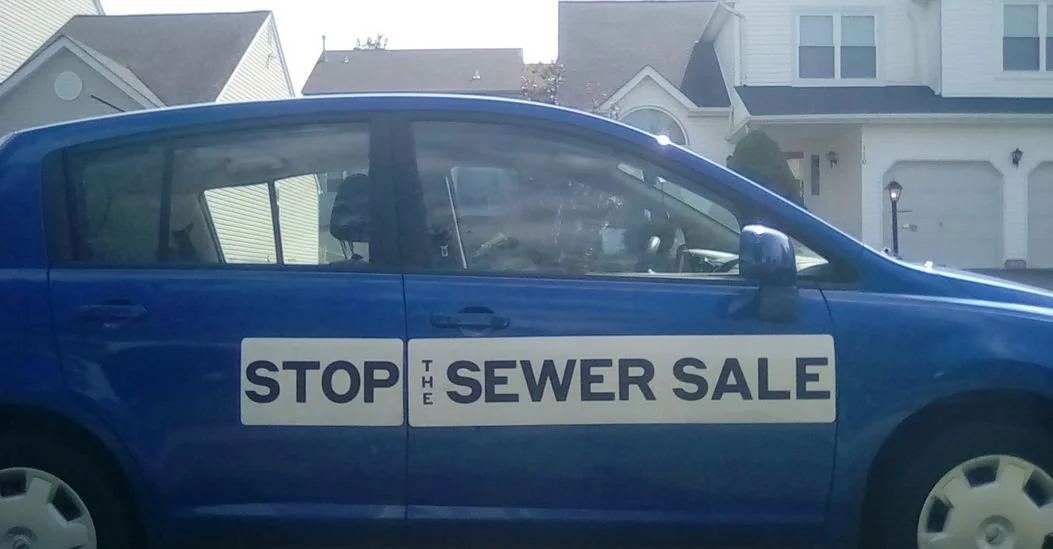
In September 2021, my quiet suburban life took a turn. Driving through Towamencin Township, north of Philadelphia, I noticed new yard signs declaring: “Stop the Sewer Sale.” Curiosity led me to a small group of passionate neighbors fighting to stop the sale of our wastewater treatment plant, a group that became NOPE: Neighbors Opposed to Privatization Efforts.
What began as local concern quickly evolved into a story about the power of community, the effectiveness of clear communication, and the impact of thoughtful design.
Design became the bridge between frustration and unity — a way to turn local concern into a shared, hopeful movement.
The Power of Branding in a Grassroots Movement
Before joining NOPE, I had spent years shaping identities and systems in corporate environments like Vanguard, SEI, and JPMorgan Chase. But this project demanded something entirely different, design not for commerce, but for clarity, unity, and trust.
For me, this work was about bringing my experience designing brand systems and a sense of intention to a grassroots effort. Good design doesn’t just make things look better; it makes them clearer, more inclusive, and more powerful. In a movement like NOPE, polish wasn’t superficial; it was how we earned trust and inspired action. Every design choice carried meaning: the utilities we relied on, the community we lived in, and the agency we fought to protect.
Designing for Community, Not Politics
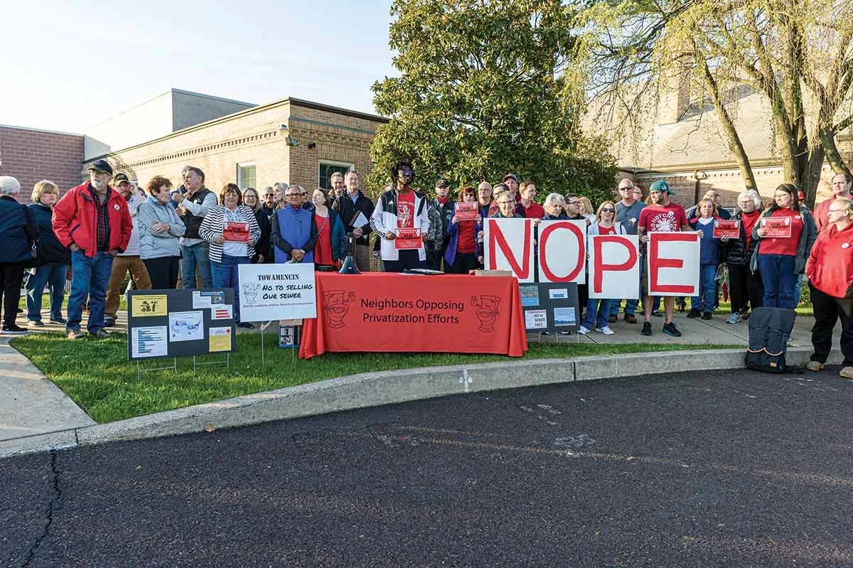
When I joined, NOPE’s early materials were effective but inconsistent. Working alongside community leaders like Katie Kelly, Vanessa Gaynor, Jenn Foster, and Kofi Osei, I helped reimagine how the movement could communicate visually and emotionally.
Example of early materials created by local residents:

“Mr. Potty” was hand-drawn by a local resident, and I loved incorporating that element into the brand system. I redrew it in Illustrator, and you’ll see it pop up in several materials. Having fun with the system was a big part of keeping the campaign approachable and community-driven.
Reaching Everyone: Print and Digital
We wanted every resident to have access to clear, accurate information, whether or not they were online. Towamencin is a mixed community, so we balanced digital updates with printed mailers, flyers, and yard signs to reach everyone. Print supported door-to-door outreach, petition signing, and community events, while digital channels helped share timely updates and visual storytelling. The mix made sure no one was left out of the conversation.
Residents coming together for petition signing with their own hand-made signs. These design elements would eventually make their way into the overall branding.
Logo & Visual Identity
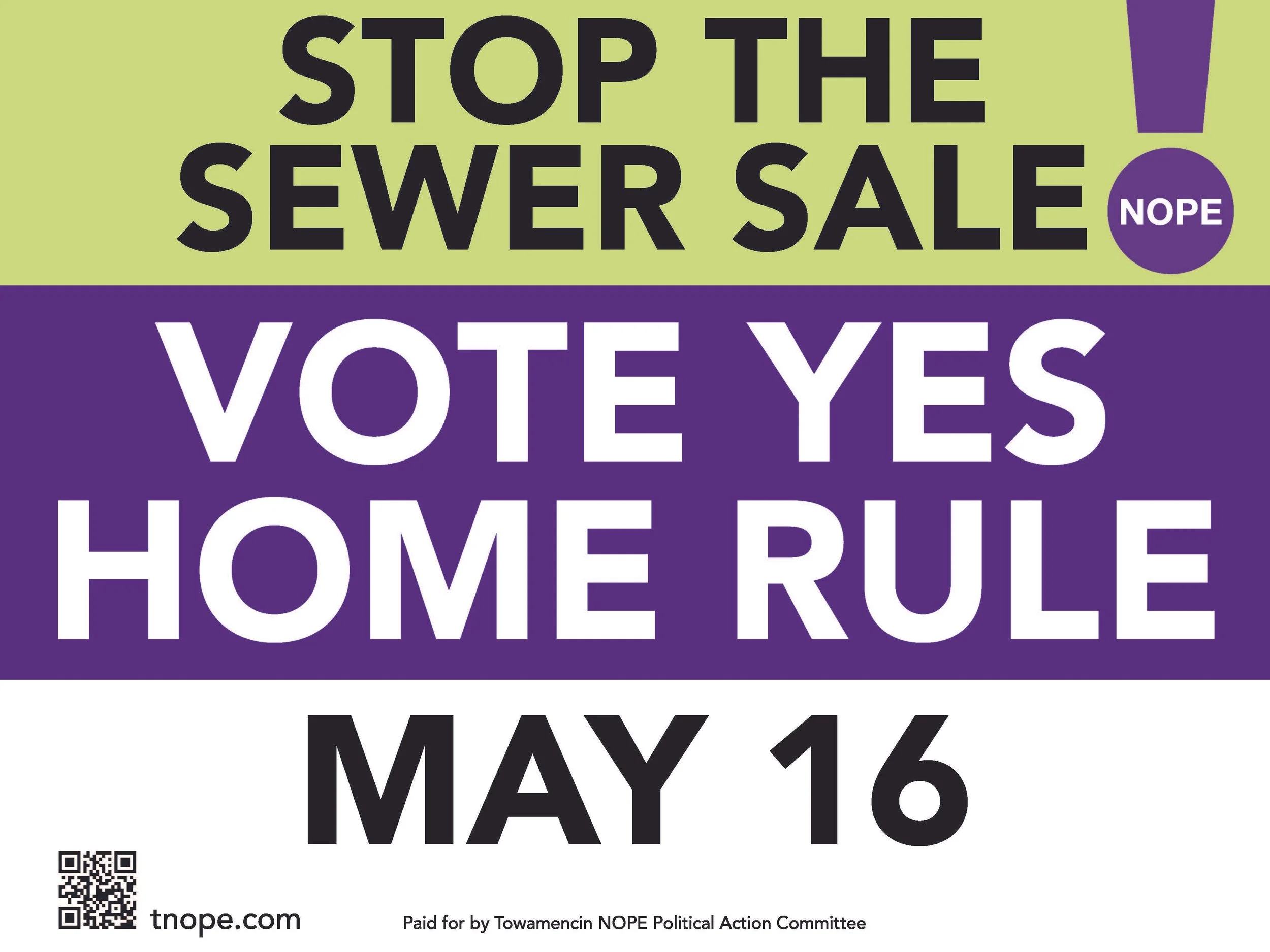
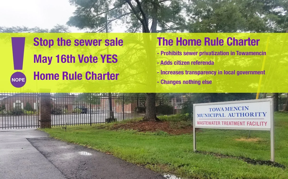
I modernized the original Norristown NOPE mark, retaining its circle symbol for unity and adding an exclamation point to capture urgency. Our color palette of purple and green was deliberately nonpartisan, bold yet neutral, signaling inclusion across political divides.
Working out the details of the logo and color system:

Lockup used for printed communications and email:
Voice & Messaging
Every word and visual was designed to inform, not inflame. The tone was factual, hopeful, and action-oriented, a language of neighbors, not sides.
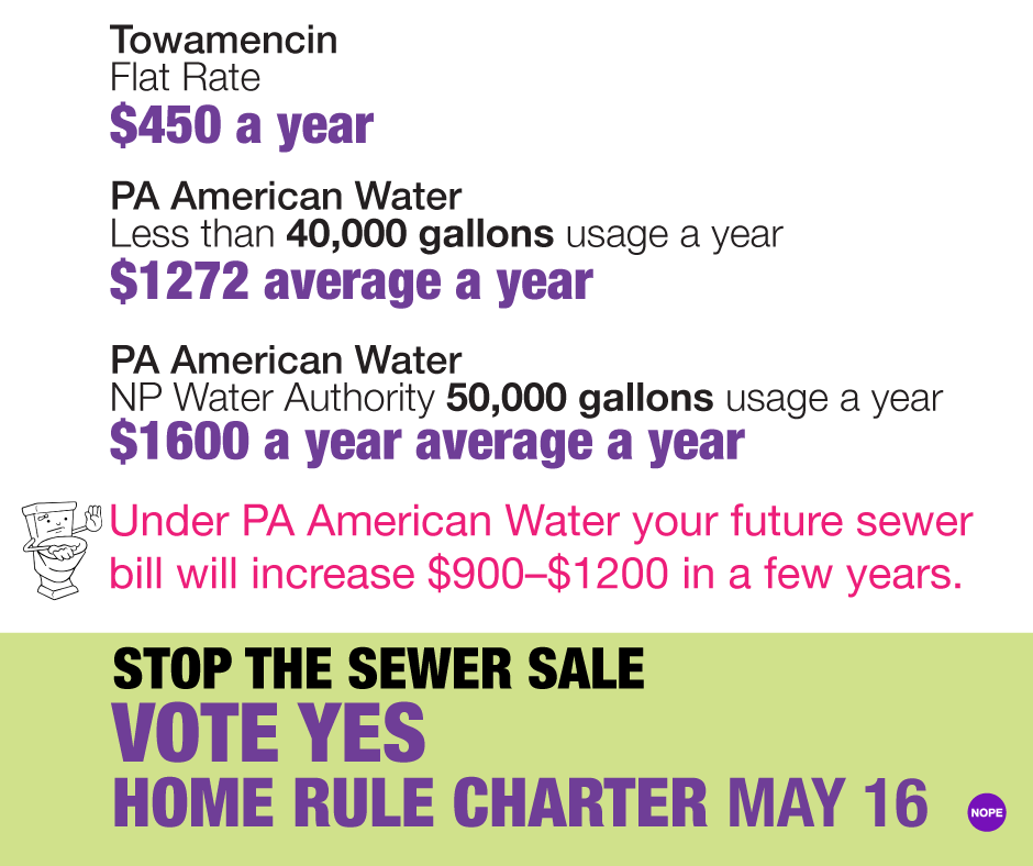
Print mailer simplifying a complex issue and urging residents to vote yes to pass the Home Rule Charter:

Back side of print mailer:

Tools & Collaboration
Without access to Adobe or Figma, we turned to Canva, a tool that allowed transparency and collaboration. Volunteers could contribute, iterate, and own the message together, reinforcing our shared mission.
Good design can thrive anywhere when people create together. Canva became our shared workspace, a place where purpose, flexibility, and collaboration turned urgency into clarity.
Yard signs:
Mailers to help elect all seven members of our bipartisan board:

Facebook series breaking down how the sale would affect residents by the numbers:

Facebook series focusing on cost increase
Facebook series focusing on cost increase
Facebook banner
Grassroots vs. Corporate Design
After years in structured, corporate design environments, this work felt refreshingly immediate. There were no layers of approval, no brand councils or committees, just real people, clear goals, and a cause worth fighting for.
Decisions were made collectively, driven by trust and necessity. It reminded me that great design doesn’t require big budgets, it requires belief, clarity, and connection.
In corporate life, I learned about systems. In grassroots life, I learned about heart. NOPE reminded me that design is most powerful when it belongs to everyone.
The Outcome
Through unified branding and consistent communication, NOPE transformed from a concerned group of residents into an organized, visible movement. Clear design helped residents understand the stakes, engage with the process, and participate meaningfully in local governance.
Our message remained simple and steadfast: keep our water system local, protect our community’s future.
Over the course of the campaign, we achieved three major election wins: one to establish the Government Study Commission, a second to elect its members, and a third to pass the final Home Rule Charter.
Reflection
Looking back, the NOPE campaign stands as one of the most meaningful projects of my career. It proved that design can be a tool for democracy, a way to empower, educate, and connect people with one another.
The experience reaffirmed what I’ve always believed: design is empathy made visible.

When creativity is rooted in purpose and collaboration, it can do more than capture attention, it can move people to act.
Project Details
Role: Design & Communications Lead
Duration: 2021–2024
Focus: Branding, Community Engagement, Digital & Print Design
Skills: Art Direction, Brand System, Design, Visual Identity, Campaign Strategy, Collaborative Tools (Canva), Accessibility, Inclusive Communication, Social Media & Video